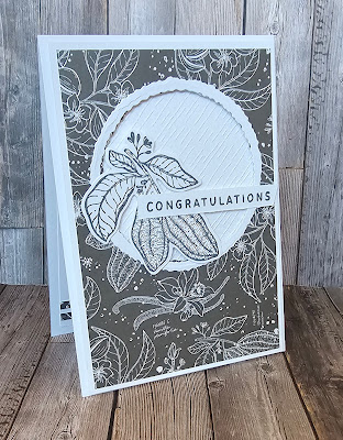
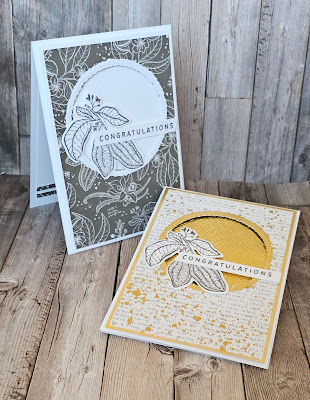
Same card but with 2 very different feels to them today. It's been said before but I'll say it again colour is a powerful tool. But in the case of today's inspiration It's the use of metalic vs colour. The colour palette I have used comes from the pattern paper that coordinates with the Lovely and Sweet stamps and dies. The paper is called Nature's Sweetness and is so very elegant.
The first card uses white and a soft shade of grey called pebbled path. The texture comes from an embossing folder that is fast becoming a favourite. It's one of a triple pack called Basics 3d embossing folders. This one give a fantastic subtle texture. All in all a very monochromatic and elegant look.


No comments:
Post a Comment