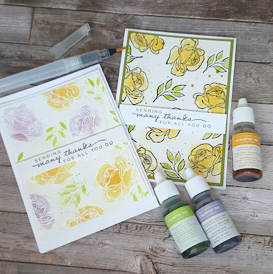
Do you find yourself always choosing the same colours? I most certainly do! I love bright bold colours often forgoing the softer tones. For me the beautiful Happiness Abounds and the gorgeous Hues of Happiness are so well suited because of the bold vibrant colours 😍
But for today's inspiration I want to step outside my comfort zone and try for a softer look. Now the colours are still bold but the use of simple watercolour colouring has made them far more subtle.
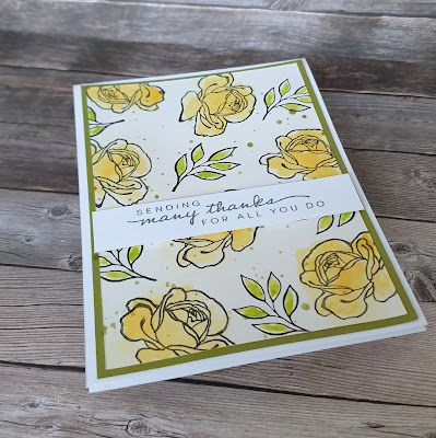
For the first card I've used shimmery white cardstock and stanped in stazon. I then spritzed each flower as I worked to add colour. I popped some reinker onto an acrylic block and gently added a drop of water to it. I then used a waterbrush to apply small amounts of the ink to flower. This is a very simple trick to flood the area with colour but the trick is to use some kitchen towel to mop it up straight away. This gives you a base layer of colour. I then went back in with the brush and added more colour.
To finish the card I flicked some green ink across the piece and mounted it onto green cardstock and then onto a white card base. A sentiment and it was completed.
Now while I was happy with this card it wasn't as soft as Id hoped for. So I thought maybe I'll try a different cardstock. So I went for watercolour card.
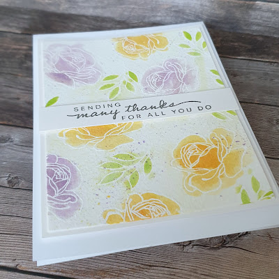
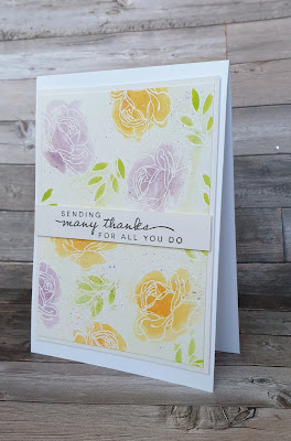
Instead of stazon I heat embossed the flowers and leaves with white embossing powder . I then used the flooding technique to colour them as before.
The effect was much softer and far more of what I had in mind. Yes the colours are bold but the overall effect is far more subtle.
Again I splatter some ink across the piece, mounted it and added it to a card base. The same sentiment was used and stamped in basic grey. The grey gives a much softer touch than black ink would.
All in all I enjoyed creating cards that used my go to colours but in a gentler way. I'm still not sure which I prefer but thats not a problem I have 2 cards that I like after all!!


No comments:
Post a Comment