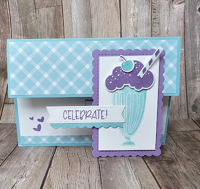
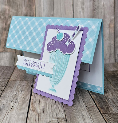
On Monday we held our monthly Card and a Cuppa get together. This session is always full of laughter and great fun. So I thought I'd create a card that used the fun Share a Milkshake bundle.
I loved the way the card turned out so much so that I made another version 🤣 so which do you like best This? The landscape version....
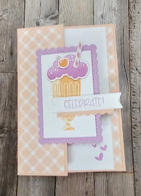
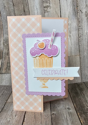
For the That version I went portrait. I also changed the colour pallette. Again it's still gives those 50's diner vibes.


No comments:
Post a Comment