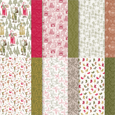
Do you use sketches? If you don't know what a sketch is it's a layout that you can follow to the tee or adjust as you desire. They are there to inspire you and are a great way to kick start your mojo if it's lost. The sketch I'm using for inspiration is one that I often turn too when I'm looking for inspiration. So I thought I'd share it with you and share 2 cards using the Saint Nicholas stamps and the coordinating pattern papers called Traditions of St Nick.
The sketch below is one that can be used in many ways. You can turn it so that it's landscape, you can change the shape of the circle, you can alter the direction of the strips.... and on and on!
I decided to use the traditions of St Nick papers. They coordinate with the stamps and general feel of vintage/ traditional style that the stamps evoke beautifully.
Now if you've been here before you'll have noticed that this colour palette is a little out of my wheelhouse... but you'll also know that I like a challenge 😆 So with that said here are 2 cards using my go to sketch and the papers.
The first card follows the sketch but I've added layers and texture. I adhered my pattern paper strips to a mat of red cardstock then ran it through my cut and emboss machine with a gorgeous 3d embossing folder called Distressed tile. I am a little obsessed with this one at the moment 😉
It's just so gorgeous and useful!
Any way back to the card.. By embossing the paper and the cardstock it give a subtle feel of fabric to the panel in my opinion. A few layers a stamped, coloured and die cut image and a sentiment and the card was done.


.jpg)


No comments:
Post a Comment